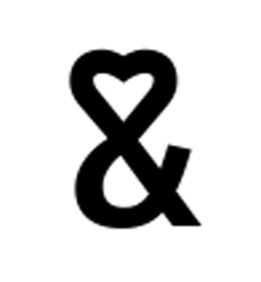
This ampersand was designed for the ‘Coming Together’ part of Font Aid IV with all benefits going to Doctors without Borders and the Haiti Earthquake Appeal. Does it have unifying properties? I say yes, since the normal “&” has been changed to incorporate a sign which is well known for the unification of two people… love, of course.
Typographically speaking it is a sans serif font and is reasonably simple in shape. It is hard to see where the joins in the “E” and the “T” are joined but they are, shown in the “just my type” book. The modern style of this particular ampersand is pleasing as it isn’t a million miles away from general san serif ampersands. The fact that it looks like it is based on a font much like “gill sans” – the creator of which didn’t approve of the use of ampersands – is quite cheeky. The ampersand does not go below the baseline and the curves of the bowl and the ligature flow very well into each other. The spine stands straight and true along its diagonal ascent giving strength to the font. The top is where the comparison to other fonts stops. The double bulge acts together with the ascender and descender in the middle to create a love heart shape.
I think if this font were a person it would be a strong and loving person, with a bouncy bubbly sense of humour. The straight edges of the ends of the font make me feel it could have another side to it as well (much like love), a side where it can be very sharp witted and hurtful. Ampersands are used to join things, like “and” and “und” etc., however the biggest use of them is joining up people’s names like “Mr & Mrs Thomson”. I think this is where this would be used in the modern world, because of the romantic styled unification of this particular ampersand – I feel it would be perfect for joining together names like love itself does.
yep.
ReplyDelete